Introduction to Flutter Widgets
Introduction
Flutter Widgets are the building blocks of every Flutter application. Understanding widgets is essential to creating interactive, responsive, and visually appealing mobile apps. Widgets define the UI structure, layout, and interactivity of a Flutter app.
In this guide, you will learn:
-
What widgets are in Flutter
-
The Widget Tree concept and widget composition
-
Basic widgets such as
Text,Button,Image,Column,Row, andContainer -
Step-by-step Flutter code examples with real-time use cases
What are Flutter Widgets?
Definition
In Flutter, everything is a widget. A widget is a reusable UI component that describes a part of the user interface and its behavior. Widgets can be stateless (unchanging) or stateful (dynamic, responds to user input).
-
StatelessWidget: Displays static content.
-
StatefulWidget: Changes dynamically based on user interaction or app state.
Lesson 03: Getting Started with Flutter: Introduction, Project Structure & First App Guide
Why widgets matter:
Widgets allow developers to compose complex UI hierarchies by nesting smaller widgets in a Widget Tree. They control layout, styling, and interactivity in Flutter apps.
Example: Simple Stateless Widget
import 'package:flutter/material.dart';

void main() {
  runApp(MyApp());
}

class MyApp extends StatelessWidget {
  @override
  Widget build(BuildContext context) {
    return MaterialApp(
      home: Scaffold(
        appBar: AppBar(title: Text('Flutter Widgets Example')),
        body: Center(
          child: Text(
            'Welcome to Flutter Widgets!',
            style: TextStyle(fontSize: 24, fontWeight: FontWeight.bold),
          ),
        ),
      ),
    );
  }
}
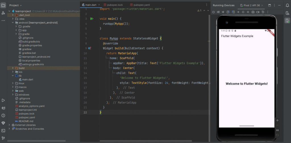
This could be the welcome screen of a mobile learning app or e-commerce app, displaying a static greeting message.
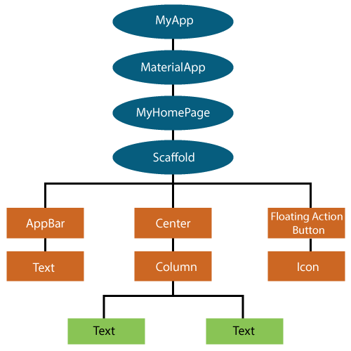
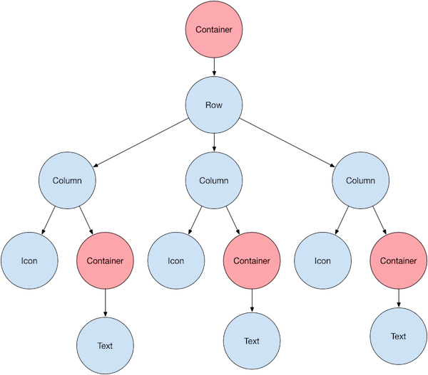
Understanding Widget Tree & Composition
Definition
The Widget Tree is a hierarchical structure that Flutter uses to compose the UI. Every widget in Flutter is a node in this tree. Parent widgets contain child widgets, creating a nested structure.
Composition refers to combining multiple widgets to create a complete UI. For example, a Column widget can contain multiple Text, Button, or Image widgets arranged vertically.

Example: Widget Tree with Column and Row
import 'package:flutter/material.dart';

void main() {
  runApp(WidgetTreeExample());
}

class WidgetTreeExample extends StatelessWidget {
  @override
  Widget build(BuildContext context) {
    return MaterialApp(
      home: Scaffold(
        appBar: AppBar(title: Text('Widget Tree Example')),
        body: Column(
          mainAxisAlignment: MainAxisAlignment.center,
          children: [
            Text('Hello, Flutter!', style: TextStyle(fontSize: 24)),
            SizedBox(height: 20),
            Row(
              mainAxisAlignment: MainAxisAlignment.center,
              children: [
                Icon(Icons.phone_android, size: 40, color: Colors.blue),
                SizedBox(width: 10),
                Icon(Icons.tablet, size: 40, color: Colors.green),
              ],
            ),
          ],
        ),
      ),
    );
  }
}
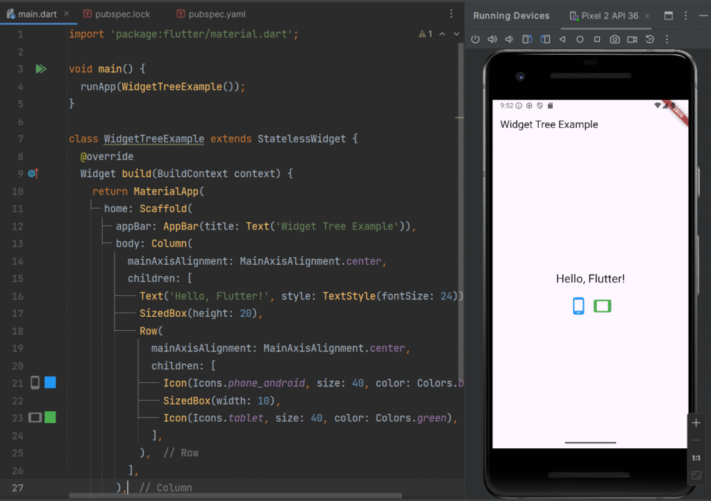
Real-Time Use Case:
This layout is used in dashboard screens, feature overviews, or home screens of mobile apps.
Want to build your strong OOP concepts and logics?
Basic Widgets in Flutter
Flutter provides many pre-built widgets for building apps quickly. Some of the most commonly used basic widgets include:
1. Text Widget
Displays text on the screen.
Text('Flutter is awesome!', style: TextStyle(fontSize: 20, color: Colors.red));
Use Case: Titles, labels, and instructions in apps.
2. Button Widget
Handles user interaction.
ElevatedButton(
onPressed: () {
print('Button clicked!');
},
child: Text('Click Me'),
);
Use Case: Submitting forms, navigating to new screens, triggering actions.
3. Image Widget
Displays images from assets or network.
Network Image:
Image.network('https://media.licdn.com/dms/image/v2/C4D03AQF5J7Q3KmhFeA/profile-displayphoto-shrink_200_200/profile-displayphoto-shrink_200_200/0/1639420698681?e=2147483647&v=beta&t=fD_egvoRItAZBBrB0jNxLwhJAkvWeE-QGGpvJJ0pu9w');
Asset Image:
Step 1: Add Image to Project
project_folder/
└── assets/
└── images/
└── my_image.png
Step 2: Register Assets in pubspec.yaml file
flutter:
assets:
– assets/images/
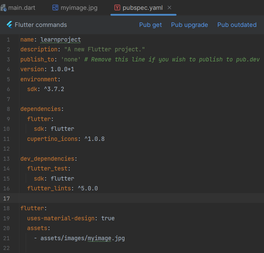
Step 3: Complete Flutter Code
import 'package:flutter/material.dart';

void main(){
  runApp(MyApp());
}

class MyApp extends StatelessWidget{
  @override
  Widget build(BuildContext context) {
    return MaterialApp(
      home: Scaffold(
        appBar: AppBar(title: Text("Widget Example"),),
        body: Center(
          child: Image.asset(
            'assets/images/myimage.jpg',
            width: 400,
            height: 300,
          ),
        )
      ),
    );

  }
}
Use Case: Product images in e-commerce apps, app logos, user avatars.
4. Column & Row Widgets
Arrange child widgets vertically (Column) or horizontally (Row).
Column(
children: [
Text('Item 1'),
Text('Item 2'),
Text('Item 3'),
],
);
Use Case: Organizing forms, menus, or multiple widgets on a screen.
5. Container Widget
A flexible box for styling, padding, and layout.
Container(
width: 150,
height: 150,
color: Colors.blue,
child: Center(
child: Text('Container', style: TextStyle(color: Colors.white)),
),
);
Use Case: Cards, banners, or custom UI components with background, margin, and padding.
Putting It All Together: Real-Time Example
import 'package:flutter/material.dart';

void main() {
  runApp(MyDashboardApp());
}

class MyDashboardApp extends StatelessWidget {
  @override
  Widget build(BuildContext context) {
    return MaterialApp(
      home: Scaffold(
        appBar: AppBar(title: Text('Flutter Dashboard')),
        body: Column(
          mainAxisAlignment: MainAxisAlignment.center,
          children: [
            Text('Welcome Back!', style: TextStyle(fontSize: 28)),
            SizedBox(height: 20),
            Container(
              padding: EdgeInsets.all(20),
              color: Colors.lightBlue,
              child: Row(
                mainAxisAlignment: MainAxisAlignment.spaceAround,
                children: [
                  Column(
                    children: [
                      Icon(Icons.message, size: 40, color: Colors.white),
                      Text('Messages', style: TextStyle(color: Colors.white)),
                    ],
                  ),
                  Column(
                    children: [
                      Icon(Icons.notifications, size: 40, color: Colors.white),
                      Text('Alerts', style: TextStyle(color: Colors.white)),
                    ],
                  ),
                  Column(
                    children: [
                      Icon(Icons.settings, size: 40, color: Colors.white),
                      Text('Settings', style: TextStyle(color: Colors.white)),
                    ],
                  ),
                ],
              ),
            ),
          ],
        ),
      ),
    );
  }
}
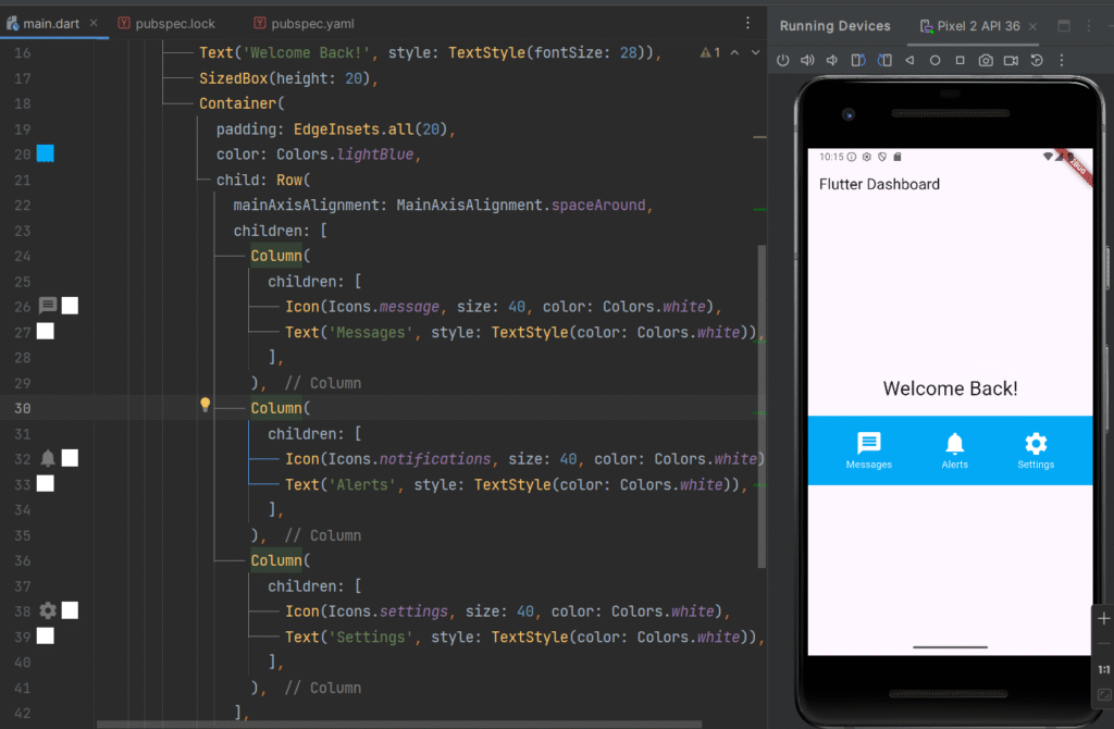
Real-Time Use Case:
This is a dashboard screen for mobile apps like messaging apps, admin panels, or utility apps, showcasing a combination of Text, Container, Row, Column, and Icon widgets.
Conclusion
Flutter widgets form the foundation of every Flutter application. By mastering basic widgets, the widget tree, and composition, developers can create responsive, interactive, and visually appealing apps efficiently.
With practice, you can combine widgets to build complex UIs, implement real-time mobile app features, and deliver production-ready applications for both Android and iOS from a single codebase.
Subscribe to our blog and stay ahead in mobile app development—get expert Flutter tutorials, real-world coding examples, and industry-ready insights delivered straight to your inbox.
Next Lesson 05: Layouts in Flutter
Lesson 05: Layouts in Flutter: Column, Row, Stack, Expanded & Flexible Guide
")

")