Layouts in Flutter: Managing Screen Space with Layout Widgets
Introduction
Layouts in Flutter define how UI elements are arranged and displayed on the screen. Proper layout management ensures that applications are responsive, scalable, and visually structured across different screen sizes and devices.
In this module, you will learn:
-
How Flutter manages screen space using layout widgets
-
Core layout widgets: Column, Row, Stack, Expanded, Flexible
-
How to build complex user interfaces using nested widgets
-
Practical Flutter (Dart) code examples with real-time use cases
Mastering layouts is essential for building professional mobile applications.
Previous Lesson: Introduction to Flutter Widgets: Widget Tree, Basic Widgets & Examples
Managing Screen Space Using Layout Widgets
Definition
In Flutter, layout widgets control the positioning, alignment, and sizing of child widgets. Flutter uses a constraint-based layout model:
-
Parent widget gives constraints
-
Child widget chooses size within constraints
-
Parent positions the child
This model makes Flutter layouts predictable and efficient.
Column Widget
Definition
column arranges its children vertically (top to bottom).
Column(
  mainAxisAlignment: MainAxisAlignment.center,
  crossAxisAlignment: CrossAxisAlignment.center,
  children: [
    Text("Name"),
    Text("Email"),
    Text("Contact"),
  ],
);
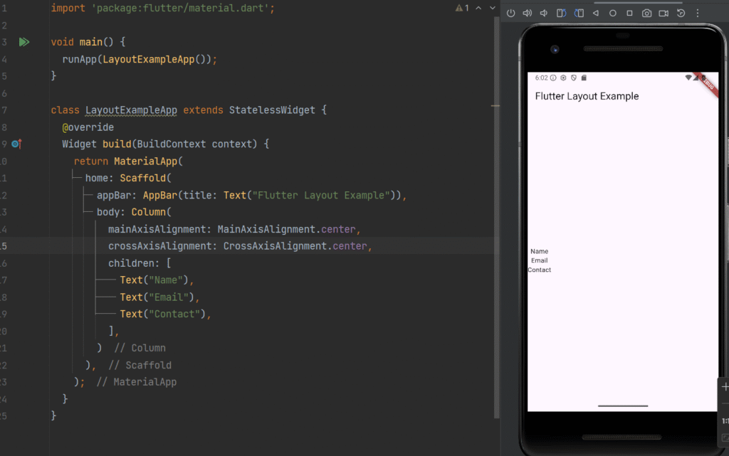
Real-Time Use Case
-
Profile screens
-
Forms
-
Settings pages
-
Vertical menus
Row Widget
Definition
row arranges its children horizontally (left to right).
Row(
  mainAxisAlignment: MainAxisAlignment.spaceEvenly,
  children: [
    Icon(Icons.home),
    Icon(Icons.search),
    Icon(Icons.person),
  ],
);
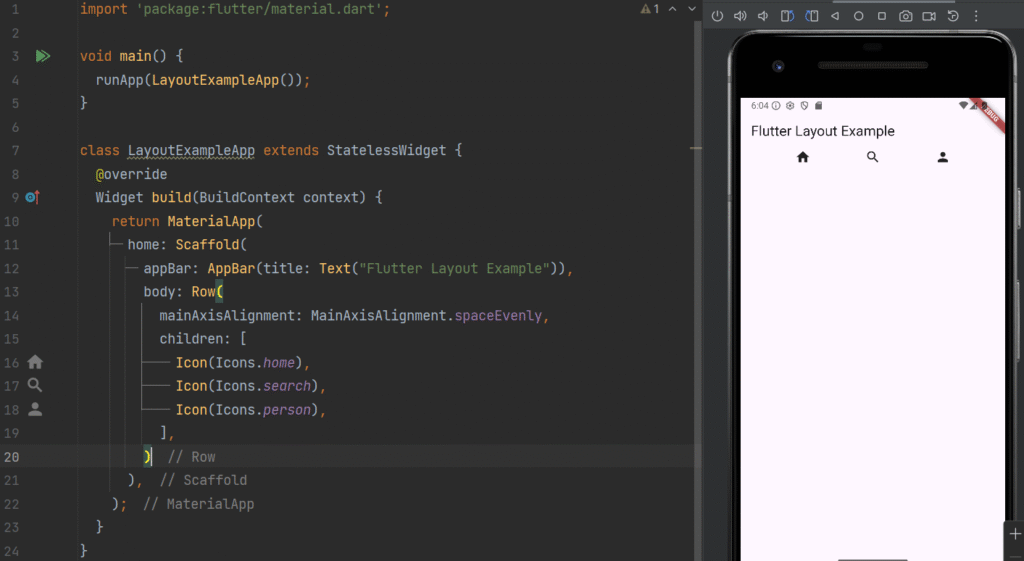
Real-Time Use Case
-
Bottom navigation bars
-
Horizontal menus
-
Action buttons
Stack Widget
Definition
stack allows widgets to be placed on top of each other (layered layout).
Stack(
  children: [
    Container(
      width: 200,
      height: 200,
      color: Colors.blue,
    ),
    Positioned(
      top: 20,
      left: 20,
      child: Text(
        "Overlay Text",
        style: TextStyle(color: Colors.white, fontSize: 20),
      ),
    ),
  ],
);
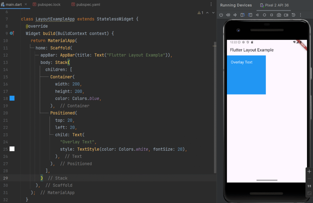
Real-Time Use Case
-
Profile image with edit icon
-
Image banners with text overlay
-
Notification badges
Expanded Widget
Definition
expanded makes a child widget take up the remaining available space inside a Row or Column.
Row(
  children: [
    Expanded(
      child: Container(color: Colors.red, height: 100),
    ),
    Expanded(
      child: Container(color: Colors.green, height: 100),
    ),
  ],
);
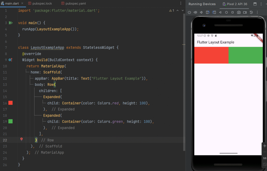
Real-Time Use Case
-
Equal-width dashboard cards
-
Responsive layouts
-
Split-screen designs
Flexible Widget
Definition
Flexible is similar to Expanded but allows more control over how much space a widget should occupy.
Row(
  children: [
    Flexible(
      flex: 2,
      child: Container(color: Colors.orange, height: 100),
    ),
    Flexible(
      flex: 1,
      child: Container(color: Colors.blue, height: 100),
    ),
  ],
);
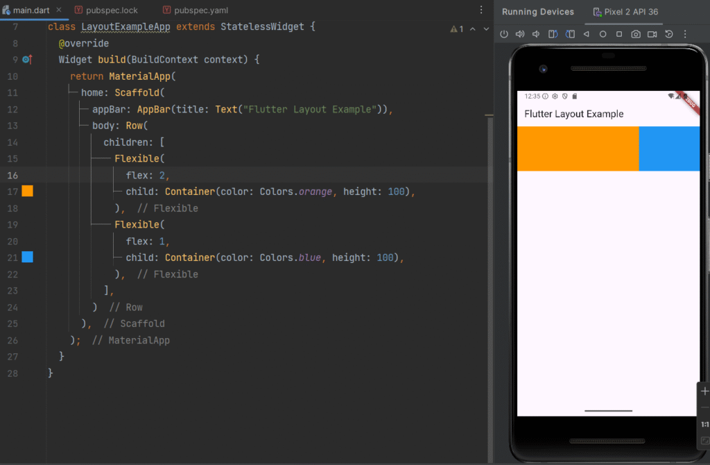
Real-Time Use Case
-
Unequal grid layouts
-
Responsive UI components
-
Adaptive dashboards
Achieving Complex UI Using Nested Widgets
Definition
Flutter allows nesting layout widgets inside one another to create complex UI structures. This technique is called widget composition.
Complex UI is built by combining:
-
Column inside Row
-
Row inside Column
-
Stack inside Container
-
Expanded inside Column
Complete Real-Time Example – Dashboard Layout
import 'package:flutter/material.dart';

void main() {
  runApp(LayoutExampleApp());
}

class LayoutExampleApp extends StatelessWidget {
  @override
  Widget build(BuildContext context) {
    return MaterialApp(
      home: Scaffold(
        appBar: AppBar(title: Text("Flutter Layout Example")),
        body: Column(
          children: [
            Expanded(
              flex: 2,
              child: Stack(
                children: [
                  Container(
                    width: double.infinity,
                    color: Colors.blue,
                  ),
                  Positioned(
                    bottom: 20,
                    left: 20,
                    child: Text(
                      "Welcome User",
                      style: TextStyle(
                          color: Colors.white,
                          fontSize: 24,
                          fontWeight: FontWeight.bold),
                    ),
                  ),
                ],
              ),
            ),
            Expanded(
              flex: 3,
              child: Row(
                children: [
                  Expanded(
                    child: Container(
                      margin: EdgeInsets.all(8),
                      color: Colors.orange,
                      child: Center(child: Text("Messages")),
                    ),
                  ),
                  Expanded(
                    child: Container(
                      margin: EdgeInsets.all(8),
                      color: Colors.green,
                      child: Center(child: Text("Notifications")),
                    ),
                  ),
                ],
              ),
            ),
          ],
        ),
      ),
    );
  }
}
Real-Time Application Scenario
This layout resembles
-
Admin dashboard
-
E-learning app home screen
-
E-commerce homepage
-
Banking application interface
It demonstrates:
-
Column for vertical structure
-
Row for horizontal arrangement
-
Stack for overlay design
-
Expanded for responsive scaling
Key Takeaways
-
Layout widgets control screen structure
-
Column = Vertical alignment
-
Row = Horizontal alignment
-
Stack = Layered layout
-
Expanded = Fill remaining space
-
Flexible = Controlled space allocation
-
Nested widgets build complex UI
Mastering Flutter layouts enables developers to create responsive, professional, and scalable mobile applications.
Next Lesson 06: Stateless vs. Stateless Widgets
")

")