
Advanced UI Design in Flutter: Elegant UI with Cards, ListTile & ListView
Introduction
User Interface (UI) design plays a crucial role in mobile application success. In Flutter, building elegant and responsive UI is easy with powerful widgets like Card, ListTile, and ListView.
This blog will guide you through:
-
Designing elegant UI using Cards
-
Using ListTile for structured content
-
Introduction to ListView for scrollable layouts
-
Practical Flutter code examples
What is Advanced UI Design in Flutter?
Advanced UI design focuses on:
-
Clean and modern layouts
-
Reusable components
-
Smooth user experience
-
Responsive design
Flutter provides pre-built widgets that help create professional UI without complex coding.
Lesson 07: Navigation in Flutter: Complete Guide to Navigator, Passing Data & Named Routes
1. Designing Elegant UI using Cards
What is a Card Widget?
A Card is a material design component that displays content inside a box with:
-
Rounded corners
-
Shadow (elevation)
-
Padding
Cards are commonly used for:
-
Product listings
-
Profile information
-
News articles
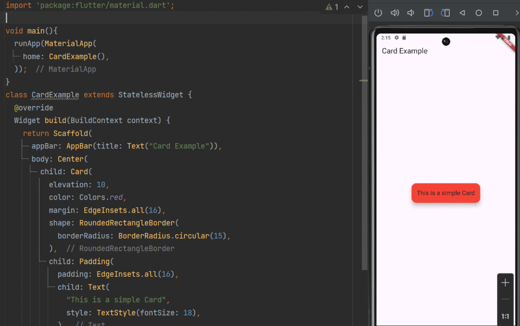
Basic Card Example
import 'package:flutter/material.dart';

void main(){
  runApp(MaterialApp(
    home: CardExample(),
  ));
}

class CardExample extends StatelessWidget {
  @override
  Widget build(BuildContext context) {
    return Scaffold(
      appBar: AppBar(title: Text("Card Example")),
      body: Center(
        child: Card(
          elevation: 10,
          margin: EdgeInsets.all(16),
          shape: RoundedRectangleBorder(
            borderRadius: BorderRadius.circular(15),
          ),
          child: Padding(
            padding: EdgeInsets.all(16),
            child: Text(
              "This is a simple Card",
              style: TextStyle(fontSize: 18),
            ),
          ),
        ),
      ),
    );
  }
}
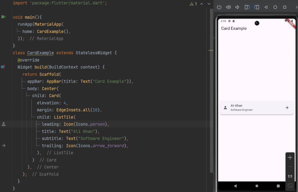
Card with ListTile (Professional UI)
import 'package:flutter/material.dart';

void main(){
  runApp(MaterialApp(
    home: CardExample(),
  ));
}
class CardExample extends StatelessWidget {
  @override
  Widget build(BuildContext context) {
    return Scaffold(
      appBar: AppBar(title: Text("Card Example")),
      body: Center(
        child: Card(
          elevation: 4,
          margin: EdgeInsets.all(10),
          child: ListTile(
            leading: Icon(Icons.person),
            title: Text("Ali Khan"),
            subtitle: Text("Software Engineer"),
            trailing: Icon(Icons.arrow_forward),
          ),
        )
      ),
    );
  }
}
Why Use Cards?
✔ Improves UI readability
✔ Creates structured layouts
✔ Adds depth using elevation
✔ Enhances user experience
2. Designing UI with ListTile
What is ListTile?
ListTile is a predefined layout for lists that includes:
-
Leading icon/image
-
Title
-
Subtitle
-
Trailing widget
It is widely used in:
-
Settings screens
-
Contact lists
-
Menus
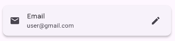
Basic ListTile Example
ListTile(
  leading: Icon(Icons.email),
  title: Text("Email"),
  subtitle: Text("user@gmail.com"),
  trailing: Icon(Icons.edit),
)
Interactive ListTile Example
ListTile(
  leading: CircleAvatar(child: Icon(Icons.person)),
  title: Text("John Doe"),
  subtitle: Text("Tap to view profile"),
  trailing: Icon(Icons.arrow_forward_ios),
  onTap: () {
    print("Tile clicked");
  },
)
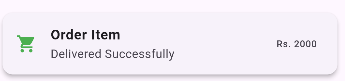
Custom Styled ListTile
import 'package:flutter/material.dart';

void main(){
  runApp(MaterialApp(
    home: CardExample(),
  ));
}
class CardExample extends StatelessWidget {
  @override
  Widget build(BuildContext context) {
    return Scaffold(
      appBar: AppBar(title: Text("Card Example")),
      body: Center(
        child: Card(
          elevation: 4,
          margin: EdgeInsets.all(10),
          child:ListTile(
            leading: Icon(Icons.shopping_cart, color: Colors.green),
            title: Text(
              "Order Item",
              style: TextStyle(fontWeight: FontWeight.bold),
            ),
            subtitle: Text("Delivered Successfully"),
            trailing: Text("Rs. 2000"),
          )
        )
      ),
    );
  }
}
Benefits of ListTile
✔ Consistent layout
✔ Easy to customize
✔ Saves development time
✔ Ideal for list-based UI
3. Introduction to ListView
What is ListView?
ListView is a scrollable widget that displays a list of items vertically or horizontally.
It is essential when:
-
You have dynamic data
-
Content exceeds screen size
-
You need scrolling
Types of ListView
| Type | Description |
|---|---|
| ListView | Static list |
| ListView.builder | Dynamic list |
| ListView.separated | List with separators |
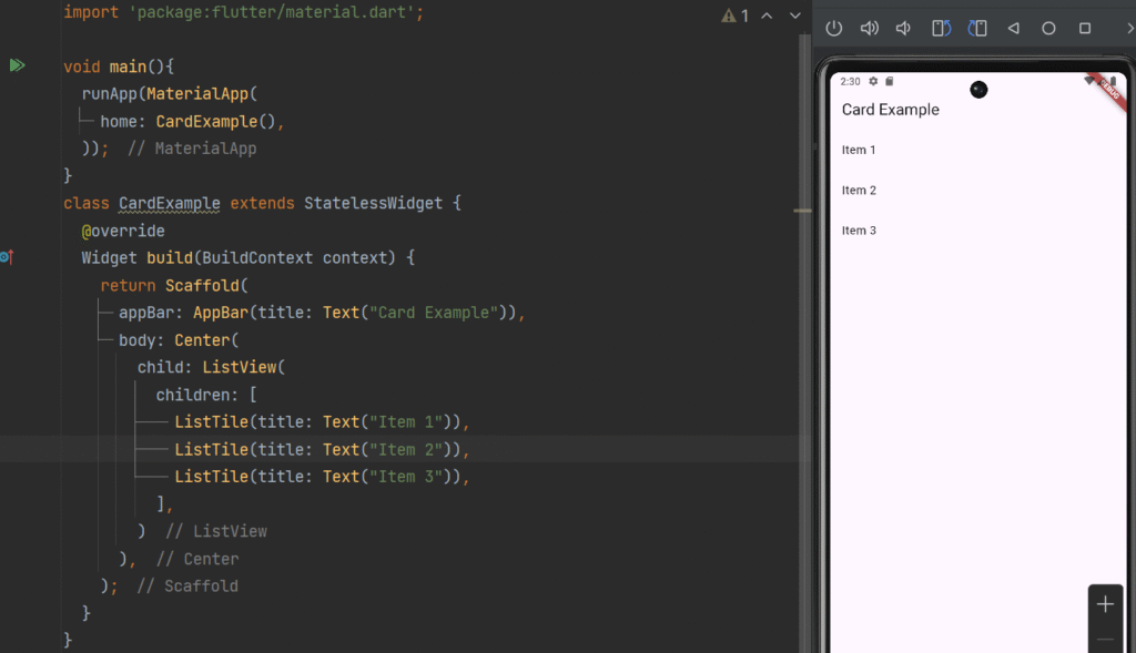
Basic ListView Example
import 'package:flutter/material.dart';

void main(){
  runApp(MaterialApp(
    home: CardExample(),
  ));
}
class CardExample extends StatelessWidget {
  @override
  Widget build(BuildContext context) {
    return Scaffold(
      appBar: AppBar(title: Text("Card Example")),
      body: Center(
        child: ListView(
          children: [
            ListTile(title: Text("Item 1")),
            ListTile(title: Text("Item 2")),
            ListTile(title: Text("Item 3")),
          ],
        )
      ),
    );
  }
}
Dynamic List using ListView.builder
Best for large datasets.
ListView.builder(
  itemCount: 10,
  itemBuilder: (context, index) {
    return ListTile(
      leading: Icon(Icons.person),
      title: Text("User $index"),
    );
  },
)
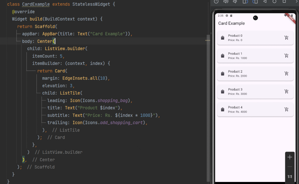
ListView with Cards (Real-World UI)
 ListView.builder(
  itemCount: 5,
  itemBuilder: (context, index) {
    return Card(
      margin: EdgeInsets.all(10),
      elevation: 3,
      child: ListTile(
        leading: Icon(Icons.shopping_bag),
        title: Text("Product $index"),
        subtitle: Text("Price: Rs. ${index * 1000}"),
        trailing: Icon(Icons.add_shopping_cart),
      ),
    );
  },
)
ListView.separated Example
ListView.separated(
  itemCount: 5,
  separatorBuilder: (context, index) => Divider(),
  itemBuilder: (context, index) {
    return ListTile(
      title: Text("Item $index"),
    );
  },
)
Real-World Example: E-Commerce UI
Using Card + ListTile + ListView:
-
Each product displayed in a Card
-
Product details in ListTile
-
All products inside ListView
This creates a clean and scrollable product list.
Best Practices for Advanced UI Design
✔ Use Cards for grouping content
✔ Use ListTile for structured data
✔ Use ListView.builder for performance
✔ Maintain consistent spacing and padding
✔ Use themes for consistent design
✔ Avoid heavy UI nesting
Common Mistakes to Avoid
❌ Using ListView inside Column without Expanded
❌ Loading large lists without builder
❌ Ignoring responsiveness
❌ Overusing nested widgets
Conclusion
Advanced UI design in Flutter becomes simple with:
-
Card → For structured containers
-
ListTile → For organized list items
-
ListView → For scrollable layouts
By combining these widgets, you can create professional, responsive, and user-friendly mobile applications.
Mastering these components will significantly improve your Flutter UI design skills and help you build real-world apps efficiently.


")