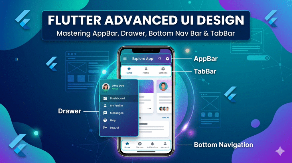
Flutter Advanced UI Design 04: AppBar, Drawer, Bottom Navigation Bar & TabBar Tutorial with Examples
Modern mobile applications rely heavily on intuitive and visually appealing User Interface (UI) components. In Flutter, several built-in widgets help developers create highly interactive and structured layouts. Among the most important components for mobile navigation are AppBar, Drawer, Bottom Navigation Bar, and TabBar with TabController.
These UI elements are widely used in real-world applications such as e-commerce apps, learning platforms, banking apps, and social media applications. In this blog, we will explore these widgets in detail, including concepts, structure, real-world use cases, and complete Flutter code examples.
Introduction to Advanced UI Design in Flutter
Flutter provides a powerful widget-based architecture for building cross-platform mobile applications. While simple UI elements such as buttons and text fields are important, advanced navigation structures are essential for building scalable apps.
The following components play a crucial role:
| Component | Purpose |
|---|---|
| AppBar | Displays the top navigation bar |
| Drawer | Side navigation menu |
| Bottom Navigation Bar | Navigation between main screens |
| TabBar with TabController | Tab-based navigation inside screens |
These components are commonly used together inside a Scaffold widget, which acts as the main layout structure of a Flutter screen.
1. AppBar in Flutter
What is an AppBar?
The AppBar is a material design widget that appears at the top of the screen. It usually contains:
-
Application title
-
Navigation icons
-
Action buttons
-
Search icons
-
Menu buttons
It helps users understand where they are inside the app.
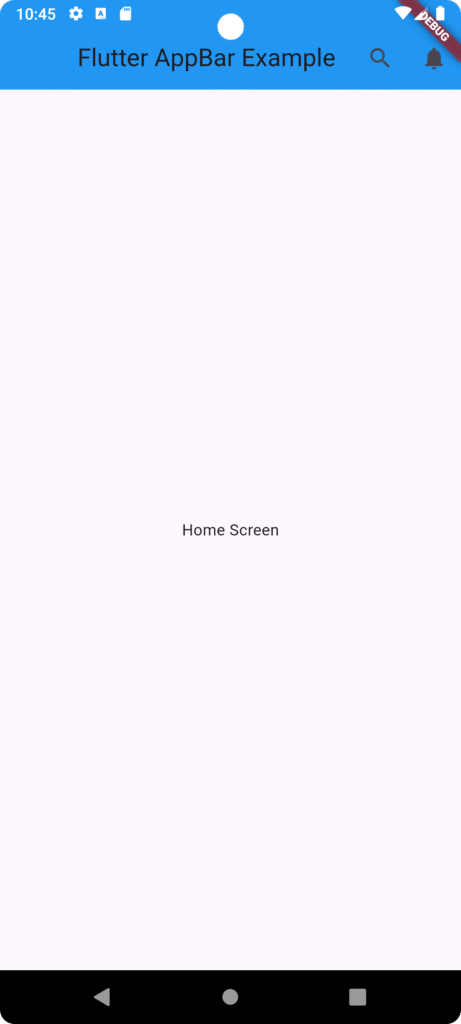
Basic AppBar Example
import 'package:flutter/material.dart';

void main() {
  runApp(MyApp());
}

class MyApp extends StatelessWidget {
  @override
  Widget build(BuildContext context) {
    return MaterialApp(
      home: HomeScreen(),
    );
  }
}

class HomeScreen extends StatelessWidget {
  @override
  Widget build(BuildContext context) {
    return Scaffold(
      appBar: AppBar(
        title: Text("Flutter AppBar Example"),
        backgroundColor: Colors.blue,
        centerTitle: true,
        actions: [
          IconButton(
            icon: Icon(Icons.search),
            onPressed: () {},
          ),
          IconButton(
            icon: Icon(Icons.notifications),
            onPressed: () {},
          ),
        ],
      ),
      body: Center(
        child: Text("Home Screen"),
      ),
    );
  }
}
Real-Time Use Case of AppBar
E-Commerce Application
In apps like Amazon or Daraz, the AppBar typically contains:
-
Search bar
-
Cart icon
-
Notification icon
-
Profile icon
This allows users to quickly access major app functions.
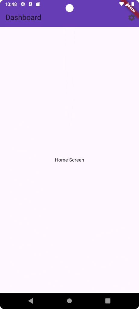
Custom AppBar with Preferred Size
import 'package:flutter/material.dart';

void main() {
  runApp(MyApp());
}

class MyApp extends StatelessWidget {
  @override
  Widget build(BuildContext context) {
    return MaterialApp(home: HomeScreen());
  }
}

class HomeScreen extends StatelessWidget {
  @override
  Widget build(BuildContext context) {
    return Scaffold(
      appBar: AppBar(
        title: Text("Dashboard"),
        backgroundColor: Colors.deepPurple,
        elevation: 10,
        actions: [Icon(Icons.settings), SizedBox(width: 10)],
      ),
      body: Center(child: Text("Home Screen")),
    );
  }
}
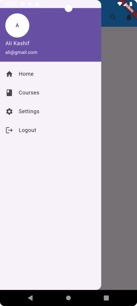
2. Drawer in Flutter
What is a Drawer?
A Drawer is a side navigation menu that slides from the left side of the screen. It is mainly used for navigating between different sections of the application.
Drawer Layout Example
Common items inside a Drawer include:
-
User Profile
-
Home
-
Courses
-
Notifications
-
Settings
-
Logout
Flutter Drawer Example
import 'package:flutter/material.dart';

void main() {
  runApp(MyApp());
}

class MyApp extends StatelessWidget {
  @override
  Widget build(BuildContext context) {
    return MaterialApp(
      home: HomeScreen(),
    );
  }
}

class HomeScreen extends StatelessWidget {
  @override
  Widget build(BuildContext context) {
    return Scaffold(
      appBar: AppBar(
        title: Text("Flutter AppBar Example"),
        backgroundColor: Colors.blue,
        centerTitle: true,
        actions: [
          IconButton(
            icon: Icon(Icons.search),
            onPressed: () {},
          ),
          IconButton(
            icon: Icon(Icons.notifications),
            onPressed: () {},
          ),
        ],
      ),
      body: Center(
        child: Text("Home Screen"),
      ),
      drawer: Drawer(
        child: ListView(
          children: [
            UserAccountsDrawerHeader(
              accountName: Text("Ali Kashif"),
              accountEmail: Text("ali@gmail.com"),
              currentAccountPicture: CircleAvatar(
                backgroundColor: Colors.white,
                child: Text("A"),
              ),
            ),
            ListTile(
              leading: Icon(Icons.home),
              title: Text("Home"),
              onTap: () {},
            ),
            ListTile(
              leading: Icon(Icons.book),
              title: Text("Courses"),
              onTap: () {},
            ),
            ListTile(
              leading: Icon(Icons.settings),
              title: Text("Settings"),
              onTap: () {},
            ),
            ListTile(
              leading: Icon(Icons.logout),
              title: Text("Logout"),
              onTap: () {},
            ),
          ],
        ),
      ),
    );
  }
}
University Mobile Application
A university app may use a Drawer for:
-
Student Portal
-
LMS Access
-
Faculty Directory
-
Campus Map
-
Notices
-
Timetable
This structure helps keep secondary navigation organized without cluttering the main screen.
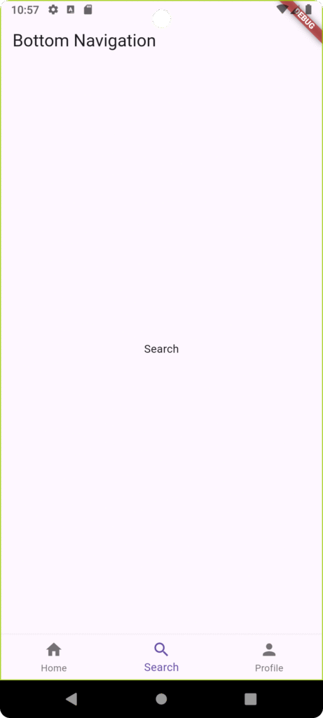
3. Bottom Navigation Bar
What is Bottom Navigation Bar?
The Bottom Navigation Bar is used for switching between major sections of an app.
It usually appears at the bottom of the screen and contains 3 to 5 icons.
Examples in Popular Apps
| App | Bottom Navigation Items |
|---|---|
| Home, Search, Reels, Shop, Profile | |
| Chats, Updates, Communities, Calls | |
| YouTube | Home, Shorts, Subscriptions, Library |
Flutter Bottom Navigation Example
import 'package:flutter/material.dart';

void main() {
  runApp(MaterialApp(
    home: BottomNavExample(),
  ));
}
class BottomNavExample extends StatefulWidget {
  @override
  _BottomNavExampleState createState() => _BottomNavExampleState();
}

class _BottomNavExampleState extends State<BottomNavExample> {

  int currentIndex = 0;

  final screens = [
    Center(child: Text("Home")),
    Center(child: Text("Search")),
    Center(child: Text("Profile")),
  ];

  @override
  Widget build(BuildContext context) {

    return Scaffold(
      appBar: AppBar(title: Text("Bottom Navigation")),
      body: screens[currentIndex],

      bottomNavigationBar: BottomNavigationBar(
        currentIndex: currentIndex,
        items: const [
          BottomNavigationBarItem(
            icon: Icon(Icons.home),
            label: "Home",
          ),

          BottomNavigationBarItem(
            icon: Icon(Icons.search),
            label: "Search",
          ),

          BottomNavigationBarItem(
            icon: Icon(Icons.person),
            label: "Profile",
          ),
        ],

        onTap: (index){
          setState(() {
            currentIndex = index;
          });
        },
      ),
    );
  }
}
Real-Time Use Case
Food Delivery App
A typical Food Delivery Application may use Bottom Navigation for:
-
Home
-
Search Restaurants
-
Orders
-
Profile
This allows users to navigate instantly between core sections.
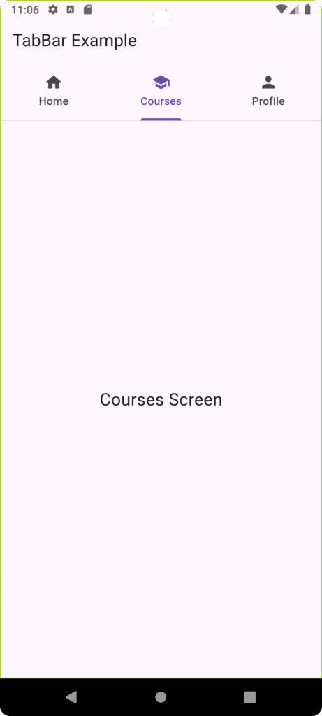
4. TabBar with TabController
What is TabBar?
TabBar allows users to switch between different tabs within the same screen.
It is commonly used with TabController and TabBarView.
Example Use Cases
| Application | Tabs |
|---|---|
| Chats, Status, Calls | |
| News App | Latest, Trending, Technology |
| Learning App | Courses, Assignments, Quizzes |
Flutter TabBar Example with TabController
import 'package:flutter/material.dart';

void main() {
  runApp(MyApp());
}

class MyApp extends StatelessWidget {

  @override
  Widget build(BuildContext context) {
    return MaterialApp(
      debugShowCheckedModeBanner: false,
      title: "Flutter TabBar Example",
      theme: ThemeData(
        primarySwatch: Colors.blue,
      ),
      home: TabBarExample(),
    );
  }
}

class TabBarExample extends StatelessWidget {

  @override
  Widget build(BuildContext context) {

    return DefaultTabController(
      length: 3,

      child: Scaffold(
        appBar: AppBar(
          title: const Text("TabBar Example"),

          bottom: const TabBar(
            tabs: [
              Tab(
                icon: Icon(Icons.home),
                text: "Home",
              ),

              Tab(
                icon: Icon(Icons.school),
                text: "Courses",
              ),

              Tab(
                icon: Icon(Icons.person),
                text: "Profile",
              ),
            ],
          ),
        ),

        body: const TabBarView(
          children: [

            Center(
              child: Text(
                "Home Screen",
                style: TextStyle(fontSize: 22),
              ),
            ),

            Center(
              child: Text(
                "Courses Screen",
                style: TextStyle(fontSize: 22),
              ),
            ),

            Center(
              child: Text(
                "Profile Screen",
                style: TextStyle(fontSize: 22),
              ),
            ),

          ],
        ),
      ),
    );
  }
}
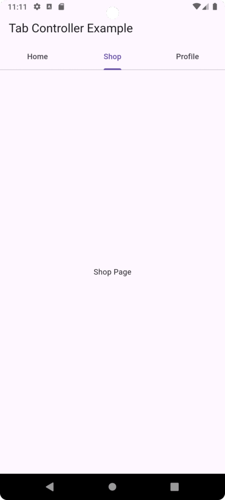
Advanced TabController Example
import 'package:flutter/material.dart';

void main() {
  runApp(MyApp());
}

class MyApp extends StatelessWidget {

  @override
  Widget build(BuildContext context) {
    return MaterialApp(
      debugShowCheckedModeBanner: false,
      title: "Flutter TabBar Example",
      theme: ThemeData(
        primarySwatch: Colors.blue,
      ),
      home: TabControllerExample(),
    );
  }
}
class TabControllerExample extends StatefulWidget {
  @override
  _TabControllerExampleState createState() => _TabControllerExampleState();
}

class _TabControllerExampleState extends State<TabControllerExample>
    with SingleTickerProviderStateMixin {

  late TabController tabController;

  @override
  void initState() {
    tabController = TabController(length: 3, vsync: this);
    super.initState();
  }

  @override
  void dispose() {
    tabController.dispose();
    super.dispose();
  }

  @override
  Widget build(BuildContext context) {

    return Scaffold(
      appBar: AppBar(
        title: Text("Tab Controller Example"),
        bottom: TabBar(
          controller: tabController,
          tabs: const [
            Tab(text: "Home"),
            Tab(text: "Shop"),
            Tab(text: "Profile"),
          ],
        ),
      ),

      body: TabBarView(
        controller: tabController,
        children: const [
          Center(child: Text("Home Page")),
          Center(child: Text("Shop Page")),
          Center(child: Text("Profile Page")),
        ],
      ),
    );
  }
}
Combining AppBar, Drawer, Bottom Navigation, and Tabs
In real-world applications, these widgets are often used together.
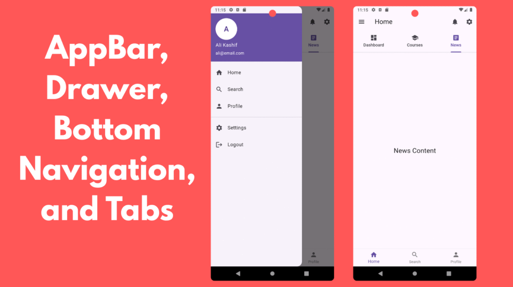
Example structure:
import 'package:flutter/material.dart';

void main() {
  runApp(MyApp());
}

class MyApp extends StatelessWidget {

  @override
  Widget build(BuildContext context) {
    return MaterialApp(
      debugShowCheckedModeBanner: false,
      title: "Advanced UI Example",
      theme: ThemeData(
        primarySwatch: Colors.indigo,
      ),
      home: MainScreen(),
    );
  }
}

class MainScreen extends StatefulWidget {
  @override
  _MainScreenState createState() => _MainScreenState();
}

class _MainScreenState extends State<MainScreen>
    with SingleTickerProviderStateMixin {

  int currentIndex = 0;

  late TabController tabController;

  final List<String> titles = [
    "Home",
    "Search",
    "Profile"
  ];

  @override
  void initState() {
    super.initState();

    tabController = TabController(length: 3, vsync: this);
  }

  @override
  void dispose() {
    tabController.dispose();
    super.dispose();
  }

  @override
  Widget build(BuildContext context) {

    return Scaffold(

      /// APPBAR
      appBar: AppBar(
        title: Text(titles[currentIndex]),

        actions: [
          IconButton(
            icon: Icon(Icons.notifications),
            onPressed: () {},
          ),

          IconButton(
            icon: Icon(Icons.settings),
            onPressed: () {},
          ),
        ],

        /// TAB BAR ONLY ON HOME SCREEN
        bottom: currentIndex == 0
            ? TabBar(
          controller: tabController,
          tabs: const [
            Tab(icon: Icon(Icons.dashboard), text: "Dashboard"),
            Tab(icon: Icon(Icons.school), text: "Courses"),
            Tab(icon: Icon(Icons.article), text: "News"),
          ],
        )
            : null,
      ),

      /// DRAWER
      drawer: Drawer(
        child: ListView(
          children: [

            UserAccountsDrawerHeader(
              accountName: Text("Ali Kashif"),
              accountEmail: Text("ali@email.com"),
              currentAccountPicture: CircleAvatar(
                backgroundColor: Colors.white,
                child: Text("A", style: TextStyle(fontSize: 24)),
              ),
            ),

            ListTile(
              leading: Icon(Icons.home),
              title: Text("Home"),
              onTap: () {
                Navigator.pop(context);
                setState(() {
                  currentIndex = 0;
                });
              },
            ),

            ListTile(
              leading: Icon(Icons.search),
              title: Text("Search"),
              onTap: () {
                Navigator.pop(context);
                setState(() {
                  currentIndex = 1;
                });
              },
            ),

            ListTile(
              leading: Icon(Icons.person),
              title: Text("Profile"),
              onTap: () {
                Navigator.pop(context);
                setState(() {
                  currentIndex = 2;
                });
              },
            ),

            Divider(),

            ListTile(
              leading: Icon(Icons.settings),
              title: Text("Settings"),
              onTap: () {},
            ),

            ListTile(
              leading: Icon(Icons.logout),
              title: Text("Logout"),
              onTap: () {},
            ),
          ],
        ),
      ),

      /// BODY
      body: getBody(),

      /// BOTTOM NAVIGATION BAR
      bottomNavigationBar: BottomNavigationBar(

        currentIndex: currentIndex,

        items: const [

          BottomNavigationBarItem(
            icon: Icon(Icons.home),
            label: "Home",
          ),

          BottomNavigationBarItem(
            icon: Icon(Icons.search),
            label: "Search",
          ),

          BottomNavigationBarItem(
            icon: Icon(Icons.person),
            label: "Profile",
          ),

        ],

        onTap: (index) {
          setState(() {
            currentIndex = index;
          });
        },
      ),
    );
  }

  /// BODY CONTENT BASED ON BOTTOM NAVIGATION
  Widget getBody() {

    if (currentIndex == 0) {
      return TabBarView(
        controller: tabController,
        children: [

          Center(
            child: Text(
              "Dashboard Content",
              style: TextStyle(fontSize: 22),
            ),
          ),

          Center(
            child: Text(
              "Courses Content",
              style: TextStyle(fontSize: 22),
            ),
          ),

          Center(
            child: Text(
              "News Content",
              style: TextStyle(fontSize: 22),
            ),
          ),
        ],
      );
    }

    if (currentIndex == 1) {
      return Center(
        child: Text(
          "Search Screen",
          style: TextStyle(fontSize: 22),
        ),
      );
    }

    return Center(
      child: Text(
        "Profile Screen",
        style: TextStyle(fontSize: 22),
      ),
    );
  }
}
Example applications:
-
University apps
-
E-learning platforms
-
Banking apps
-
E-commerce apps
Best Practices for Flutter UI Navigation
1. Limit Bottom Navigation Items
Use 3–5 items maximum.
2. Use Drawer for Secondary Navigation
Do not overload the main UI.
3. Use Tabs for Related Content
Tabs should contain closely related information.
4. Keep AppBar Clean
Avoid too many action icons.
5. Maintain UI Consistency
Ensure navigation elements behave predictably across screens.
Advantages of Using These UI Components
| Feature | Benefit |
|---|---|
| AppBar | Clear navigation hierarchy |
| Drawer | Organized side menu |
| Bottom Navigation | Quick access to main features |
| TabBar | Easy switching between related content |
These components improve:
-
User Experience (UX)
-
Navigation flow
-
Application scalability
Conclusion
Advanced UI components such as AppBar, Drawer, Bottom Navigation Bar, and TabBar with TabController play a fundamental role in designing modern mobile applications using Flutter.
They help developers create clean, organized, and user-friendly interfaces while improving navigation efficiency.
By mastering these widgets, developers can design professional mobile applications such as:
-
E-learning platforms
-
Banking apps
-
Social media apps
-
University management systems
-
E-commerce applications
Flutter’s flexible widget system makes it easy to combine these components to build powerful and scalable mobile interfaces.


