
Dialogs & User Interaction in Flutter: AlertDialog, Custom Dialogs, SnackBars, and Toast Messages (Practical Lab Guide)
Modern mobile applications are not just about functionality—they are also about user interaction and feedback. When users perform actions such as logging in, signing up, submitting forms, or making changes, the app must communicate clearly with them. In Flutter, dialogs and notification messages are the primary way to achieve this.
In this practical lab tutorial, you will learn how to implement AlertDialog, Custom Dialogs, SnackBars, and Toast Messages in a Flutter application. These components help create a professional and user-friendly interface, similar to the login and signup screens shown above.
This guide is ideal for Flutter students, beginners, and mobile app development learners who want hands-on experience implementing user interaction features in real-world applications.
Table of Contents
-
Introduction to Dialogs and User Interaction in Flutter
-
Why Dialogs and Notifications Matter in Mobile Apps
-
Flutter AlertDialog Implementation
-
Creating Custom Dialogs in Flutter
-
Displaying SnackBars in Flutter
-
Showing Toast Messages in Flutter
-
Practical Lab Example (Login & Signup Interaction)
-
Best Practices for Flutter User Interaction
-
Common Mistakes to Avoid
-
Conclusion
1. Introduction to Dialogs and User Interaction in Flutter
User interaction elements in Flutter provide real-time feedback to users. These components notify users about events, errors, confirmations, or successful actions.
Flutter offers several built-in widgets for this purpose:
| Widget | Purpose |
|---|---|
| AlertDialog | Shows confirmation or warning message |
| Custom Dialog | Fully customized popup UI |
| SnackBar | Temporary message displayed at bottom |
| Toast Message | Quick popup notification |
These interaction components are commonly used in applications such as:
-
Login & signup systems
-
Form submission validation
-
Delete confirmation prompts
-
Success notifications
-
Error messages
2. Why Dialogs and Notifications Matter in Mobile Apps
Imagine a login application like the one shown above. When a user enters an incorrect password, the system must immediately notify them.
Without proper interaction messages:
-
Users become confused
-
Errors go unnoticed
-
UX becomes poor
With dialogs and notifications:
✔ Errors are clearly displayed
✔ Users receive confirmation messages
✔ Actions feel responsive
✔ Application looks professional
3. Creating an AlertDialog in Flutter
An AlertDialog is a popup window that appears in the center of the screen to get the user’s attention.
It is commonly used for:
-
Delete confirmations
-
Login errors
-
Warning messages
-
Information prompts
Basic AlertDialog Syntax
showDialog(
  context: context,
  builder: (context) {
    return AlertDialog(
      title: Text("Login Failed"),
      content: Text("Invalid email or password"),
      actions: [
        TextButton(
          onPressed: () {
            Navigator.pop(context);
          },
          child: Text("OK"),
        )
      ],
    );
  },
);
Practical Example: Login Error Dialog
If the user enters incorrect login credentials:
void showLoginError(BuildContext context) {
  showDialog(
    context: context,
    builder: (context) {
      return AlertDialog(
        title: Text("Login Error"),
        content: Text("Incorrect email or password."),
        actions: [
          TextButton(
            onPressed: () {
              Navigator.pop(context);
            },
            child: Text("Try Again"),
          )
        ],
      );
    },
  );
}
4. Creating Custom Dialogs in Flutter
Sometimes the default AlertDialog design is not sufficient. Flutter allows developers to build custom dialog layouts.
Custom dialogs can include:
-
Images
-
Icons
-
Animations
-
Custom buttons
-
Branding
Example: Custom Success Dialog
void showSuccessDialog(BuildContext context) {
  showDialog(
    context: context,
    builder: (context) {
      return Dialog(
        shape: RoundedRectangleBorder(
          borderRadius: BorderRadius.circular(20),
        ),
        child: Container(
          padding: EdgeInsets.all(20),
          height: 200,
          child: Column(
            mainAxisAlignment: MainAxisAlignment.center,
            children: [
              Icon(Icons.check_circle, color: Colors.green, size: 60),
              SizedBox(height: 10),
              Text(
                "Account Created Successfully!",
                style: TextStyle(fontSize: 18),
              ),
              SizedBox(height: 20),
              ElevatedButton(
                onPressed: () {
                  Navigator.pop(context);
                },
                child: Text("Continue"),
              )
            ],
          ),
        ),
      );
    },
  );
}
This dialog can be displayed after successful signup.
5. Displaying SnackBars in Flutter
A SnackBar is a temporary message displayed at the bottom of the screen.
It is ideal for:
-
Quick notifications
-
Success messages
-
Error alerts
-
Undo actions
Basic SnackBar Example
ScaffoldMessenger.of(context).showSnackBar(
  SnackBar(
    content: Text("Profile Updated Successfully"),
  ),
);
Advanced SnackBar Design
ScaffoldMessenger.of(context).showSnackBar(
  SnackBar(
    content: Text("Error occurred"),
    backgroundColor: Colors.red,
    behavior: SnackBarBehavior.floating,
    shape: RoundedRectangleBorder(
      borderRadius: BorderRadius.circular(10),
    ),
  ),
);
This creates a floating styled SnackBar.
6. Showing Toast Messages in Flutter
Toast messages are small popup notifications that disappear automatically.
Flutter supports toast messages using the fluttertoast package.
Step 1: Add Dependency
Add this in pubspec.yaml.
fluttertoast: ^8.2.2
Step 2: Import Package
import ‘package:fluttertoast/fluttertoast.dart’;
Step 3: Display Toast Message
Fluttertoast.showToast(
  msg: "Profile Updated Successfully",
  toastLength: Toast.LENGTH_SHORT,
  gravity: ToastGravity.BOTTOM,
  backgroundColor: Colors.black,
  textColor: Colors.white,
);
Best Practices for Flutter Dialogs
Follow these professional guidelines when implementing user interaction.
Keep Messages Short
Users should understand the message immediately.
Use Icons
Icons improve visual clarity.
Provide Clear Actions
Buttons like:
-
OK
-
Cancel
-
Retry
-
Continue
Avoid Too Many Popups
Too many dialogs annoy users.
Use SnackBars for Minor Feedback
SnackBars are less intrusive than dialogs.
Common Mistakes to Avoid
Using Dialogs for Simple Messages
Instead, use SnackBars or Toast.
Blocking User Flow
Avoid dialogs that prevent user interaction unnecessarily.
Not Handling Context Properly
Ensure context is available when showing dialogs.
Overusing Toast Messages
Toast messages should be used sparingly.
Real-World Applications
These Flutter interaction components are widely used in:
-
Banking Apps
-
E-commerce Apps
-
Social Media Apps
-
University Student Portals
-
Online Learning Apps
For example:
When a student logs into a university mobile application, the system might:
-
Show a SnackBar for successful login
-
Display an AlertDialog for incorrect credentials
-
Show a Toast message when profile updates
-
Display a Custom Dialog for announcements
Conclusion
Dialogs and notifications are essential for building interactive Flutter applications. Using widgets like AlertDialog, Custom Dialogs, SnackBars, and Toast messages, developers can create apps that communicate effectively with users.
In this practical Flutter lab, you learned:
✔ How to create AlertDialog
✔ How to design Custom Dialogs
✔ How to display SnackBars
✔ How to show Toast messages
✔ How to integrate them in login and signup screens
Mastering these components helps you develop professional, responsive, and user-friendly Flutter applications.
Complete Flutter Login & Signup application source code
Project Structure:
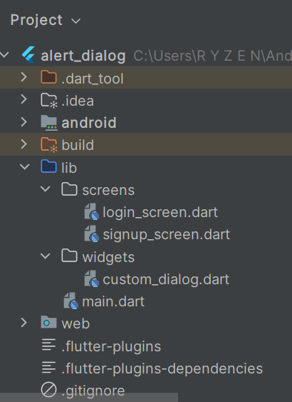
main.dart
import 'package:flutter/material.dart';
import 'screens/login_screen.dart';

void main() {
  runApp(MyApp());
}

class MyApp extends StatelessWidget {

  @override
  Widget build(BuildContext context) {
    return MaterialApp(
      debugShowCheckedModeBanner: false,
      title: "Flutter Login App",
      theme: ThemeData(
        primarySwatch: Colors.deepPurple,
      ),
      home: LoginScreen(),
    );
  }
}
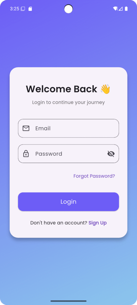
Login Screen (login_screen.dart)
import 'package:flutter/material.dart';
import 'package:fluttertoast/fluttertoast.dart';
import 'signup_screen.dart';

class LoginScreen extends StatefulWidget {
  @override
  _LoginScreenState createState() => _LoginScreenState();
}

class _LoginScreenState extends State<LoginScreen> {

  final _formKey = GlobalKey<FormState>();

  TextEditingController emailController = TextEditingController();
  TextEditingController passwordController = TextEditingController();

  bool isHidden = true;

  void loginUser() {

    if(_formKey.currentState!.validate()){

      Fluttertoast.showToast(
        msg: "Login Successful",
        backgroundColor: Colors.green,
        textColor: Colors.white,
      );

      ScaffoldMessenger.of(context).showSnackBar(
        SnackBar(
          content: Text("Welcome Back!"),
          behavior: SnackBarBehavior.floating,
        ),
      );

    } else {

      showDialog(
        context: context,
        builder: (context) {
          return AlertDialog(
            title: Text("Login Error"),
            content: Text("Please enter valid information."),
            actions: [
              TextButton(
                onPressed: (){
                  Navigator.pop(context);
                },
                child: Text("OK"),
              )
            ],
          );
        },
      );

    }

  }

  @override
  Widget build(BuildContext context) {

    return Scaffold(
      body: Container(
        decoration: BoxDecoration(
          gradient: LinearGradient(
            colors: [Colors.deepPurple, Colors.blue],
          ),
        ),

        child: Center(
          child: SingleChildScrollView(
            child: Card(
              margin: EdgeInsets.all(20),
              shape: RoundedRectangleBorder(
                borderRadius: BorderRadius.circular(20),
              ),
              child: Padding(
                padding: EdgeInsets.all(25),

                child: Form(
                  key: _formKey,
                  child: Column(
                    children: [

                      Text(
                        "Welcome Back 👋",
                        style: TextStyle(
                          fontSize: 28,
                          fontWeight: FontWeight.bold,
                        ),
                      ),

                      SizedBox(height: 10),

                      Text("Login to continue your journey"),

                      SizedBox(height: 30),

                      TextFormField(
                        controller: emailController,
                        decoration: InputDecoration(
                          prefixIcon: Icon(Icons.email),
                          labelText: "Email",
                          border: OutlineInputBorder(
                            borderRadius: BorderRadius.circular(30),
                          ),
                        ),
                        validator: (value){
                          if(value!.isEmpty){
                            return "Enter Email";
                          }
                          return null;
                        },
                      ),

                      SizedBox(height: 20),

                      TextFormField(
                        controller: passwordController,
                        obscureText: isHidden,
                        decoration: InputDecoration(
                          prefixIcon: Icon(Icons.lock),
                          labelText: "Password",
                          suffixIcon: IconButton(
                            icon: Icon(isHidden
                                ? Icons.visibility_off
                                : Icons.visibility),
                            onPressed: (){
                              setState(() {
                                isHidden = !isHidden;
                              });
                            },
                          ),
                          border: OutlineInputBorder(
                            borderRadius: BorderRadius.circular(30),
                          ),
                        ),
                        validator: (value){
                          if(value!.length < 6){
                            return "Password must be 6 characters";
                          }
                          return null;
                        },
                      ),

                      SizedBox(height: 10),

                      Align(
                        alignment: Alignment.centerRight,
                        child: TextButton(
                          onPressed: (){
                            ScaffoldMessenger.of(context).showSnackBar(
                              SnackBar(
                                content: Text("Forgot Password Clicked"),
                              ),
                            );
                          },
                          child: Text("Forgot Password?"),
                        ),
                      ),

                      SizedBox(height: 20),

                      SizedBox(
                        width: double.infinity,
                        height: 50,
                        child: ElevatedButton(
                          onPressed: loginUser,
                          child: Text("Login"),
                        ),
                      ),

                      SizedBox(height: 20),

                      Row(
                        mainAxisAlignment: MainAxisAlignment.center,
                        children: [

                          Text("Don't have an account? "),

                          GestureDetector(
                            onTap: (){
                              Navigator.push(
                                context,
                                MaterialPageRoute(
                                  builder: (context)=>SignupScreen(),
                                ),
                              );
                            },
                            child: Text(
                              "Sign Up",
                              style: TextStyle(
                                color: Colors.deepPurple,
                                fontWeight: FontWeight.bold,
                              ),
                            ),
                          )

                        ],
                      )

                    ],
                  ),
                ),
              ),
            ),
          ),
        ),
      ),
    );
  }
}
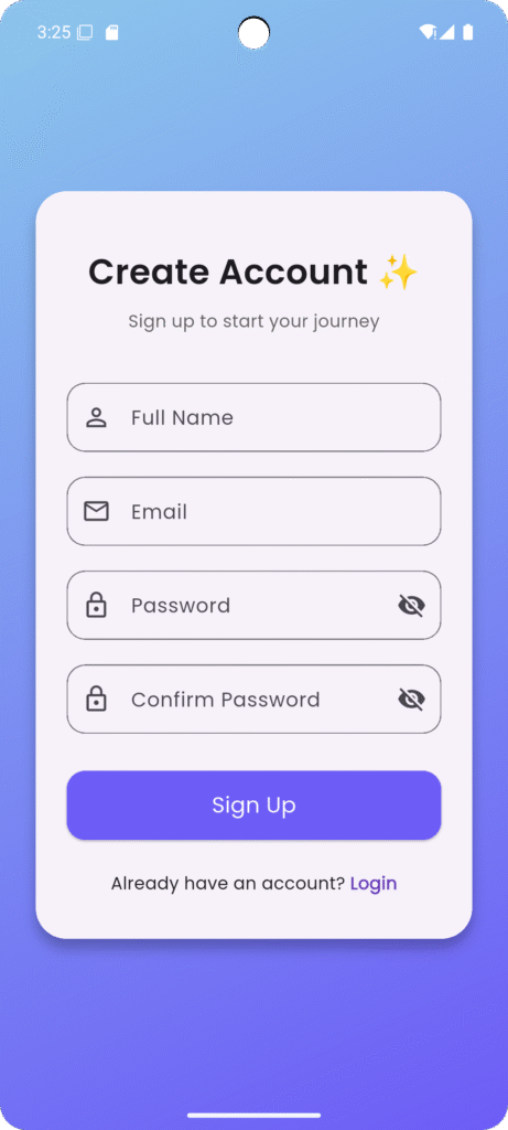
Signup Screen (signup_screen.dart)
import 'package:flutter/material.dart';
import 'package:fluttertoast/fluttertoast.dart';

class SignupScreen extends StatefulWidget {

  @override
  _SignupScreenState createState() => _SignupScreenState();
}

class _SignupScreenState extends State<SignupScreen> {

  final _formKey = GlobalKey<FormState>();

  TextEditingController name = TextEditingController();
  TextEditingController email = TextEditingController();
  TextEditingController password = TextEditingController();
  TextEditingController confirm = TextEditingController();

  void signupUser(){

    if(password.text != confirm.text){

      showDialog(
        context: context,
        builder: (context){
          return AlertDialog(
            title: Text("Password Error"),
            content: Text("Passwords do not match"),
            actions: [
              TextButton(
                onPressed: (){
                  Navigator.pop(context);
                },
                child: Text("OK"),
              )
            ],
          );
        },
      );

    }
    else{

      Fluttertoast.showToast(
        msg: "Account Created Successfully",
        backgroundColor: Colors.green,
        textColor: Colors.white,
      );

      Navigator.pop(context);

    }

  }

  @override
  Widget build(BuildContext context) {

    return Scaffold(

      body: Container(
        decoration: BoxDecoration(
          gradient: LinearGradient(
            colors: [Colors.blue, Colors.deepPurple],
          ),
        ),

        child: Center(
          child: SingleChildScrollView(

            child: Card(
              margin: EdgeInsets.all(20),
              shape: RoundedRectangleBorder(
                borderRadius: BorderRadius.circular(20),
              ),

              child: Padding(
                padding: EdgeInsets.all(25),

                child: Form(
                  key: _formKey,
                  child: Column(

                    children: [

                      Text(
                        "Create Account ✨",
                        style: TextStyle(
                          fontSize: 28,
                          fontWeight: FontWeight.bold,
                        ),
                      ),

                      SizedBox(height: 20),

                      TextFormField(
                        controller: name,
                        decoration: InputDecoration(
                          labelText: "Full Name",
                          prefixIcon: Icon(Icons.person),
                          border: OutlineInputBorder(
                            borderRadius: BorderRadius.circular(30),
                          ),
                        ),
                      ),

                      SizedBox(height: 20),

                      TextFormField(
                        controller: email,
                        decoration: InputDecoration(
                          labelText: "Email",
                          prefixIcon: Icon(Icons.email),
                          border: OutlineInputBorder(
                            borderRadius: BorderRadius.circular(30),
                          ),
                        ),
                      ),

                      SizedBox(height: 20),

                      TextFormField(
                        controller: password,
                        decoration: InputDecoration(
                          labelText: "Password",
                          prefixIcon: Icon(Icons.lock),
                          border: OutlineInputBorder(
                            borderRadius: BorderRadius.circular(30),
                          ),
                        ),
                      ),

                      SizedBox(height: 20),

                      TextFormField(
                        controller: confirm,
                        decoration: InputDecoration(
                          labelText: "Confirm Password",
                          prefixIcon: Icon(Icons.lock),
                          border: OutlineInputBorder(
                            borderRadius: BorderRadius.circular(30),
                          ),
                        ),
                      ),

                      SizedBox(height: 30),

                      SizedBox(
                        width: double.infinity,
                        height: 50,
                        child: ElevatedButton(
                          onPressed: signupUser,
                          child: Text("Sign Up"),
                        ),
                      ),

                      SizedBox(height: 20),

                      Row(
                        mainAxisAlignment: MainAxisAlignment.center,
                        children: [

                          Text("Already have an account? "),

                          GestureDetector(
                            onTap: (){
                              Navigator.pop(context);
                            },
                            child: Text(
                              "Login",
                              style: TextStyle(
                                color: Colors.deepPurple,
                                fontWeight: FontWeight.bold,
                              ),
                            ),
                          )

                        ],
                      )

                    ],
                  ),
                ),
              ),
            ),
          ),
        ),
      ),
    );
  }
}
Features Implemented
| Feature | Implemented |
|---|---|
| Login UI | ✅ |
| Signup UI | ✅ |
| Form Validation | ✅ |
| AlertDialog | ✅ |
| SnackBar | ✅ |
| Toast Message | ✅ |
| Password Visibility Toggle | ✅ |
| Navigation | ✅ |


