
Dialogs, AlertDialog, Custom Dialogs, SnackBars & Toast Messages with Practical Examples
Introduction
Modern mobile applications are not just about screens and buttons. They rely heavily on user interaction feedback mechanisms such as:
-
Dialogs
-
AlertDialog
-
Custom Dialogs
-
SnackBars
-
Toast Messages
These components enhance user experience (UX) by:
-
Confirming user actions
-
Displaying warnings
-
Showing success or error messages
-
Providing temporary feedback
In this advanced UI design guide, you will learn how to implement these interaction components in Flutter with real working examples.
Lesson 09: Advanced UI Design in Flutter: ListView Methods, Click Handling & Scrolling Performance
1️⃣ Dialogs in Flutter
A Dialog is a small pop-up window that appears in front of the current screen to:
-
Get confirmation
-
Display information
-
Prevent accidental actions
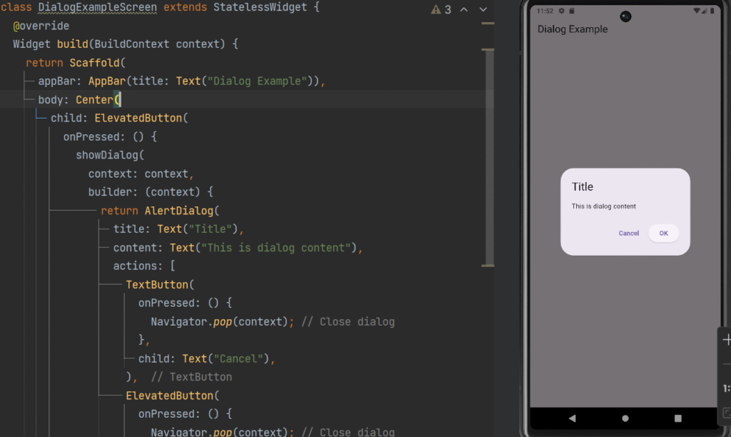
Flutter provides the showDialog() method.
Basic Dialog Structure
import 'package:flutter/material.dart';


class DialogExampleScreen extends StatelessWidget {
  @override
  Widget build(BuildContext context) {
    return Scaffold(
      appBar: AppBar(title: Text("Dialog Example")),
      body: Center(
        child: ElevatedButton(
          onPressed: () {
            showDialog(
              context: context,
              builder: (context) {
                return AlertDialog(
                  title: Text("Title"),
                  content: Text("This is dialog content"),
                  actions: [
                    TextButton(
                      onPressed: () {
                        Navigator.pop(context); // Close dialog
                      },
                      child: Text("Cancel"),
                    ),
                    ElevatedButton(
                      onPressed: () {
                        Navigator.pop(context); // Close dialog
                        print("Confirmed");
                      },
                      child: Text("OK"),
                    ),
                  ],
                );
              },
            );
          },
          child: Text("Show Dialog"),
        ),
      ),
    );
  }
}
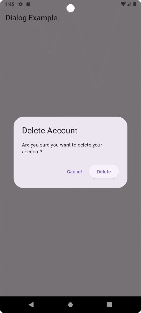
2️⃣ Creating an AlertDialog (Practical Example)
Example: Delete Confirmation Dialog
import 'package:flutter/material.dart';


class DialogExampleScreen extends StatelessWidget {
  @override
  Widget build(BuildContext context) {
    return Scaffold(
      appBar: AppBar(title: Text("Dialog Example")),
      body: Center(
        child: ElevatedButton(
          onPressed: () {
            showDialog(
              context: context,
              builder: (context) {
                return AlertDialog(
                  title: const Text("Delete Account"),
                  content: const Text(
                      "Are you sure you want to delete your account?"),
                  actions: [
                    TextButton(
                      onPressed: () {
                        Navigator.pop(context); // Close dialog
                      },
                      child: const Text("Cancel"),
                    ),
                    ElevatedButton(
                      onPressed: () {
                        Navigator.pop(context);
                        ScaffoldMessenger.of(context).showSnackBar(
                          const SnackBar(content: Text("Account Deleted")),
                        );
                      },
                      child: const Text("Delete"),
                    )
                  ],
                );
              },
            );
          },
          child: const Text("Delete Account"),
        )
      ),
    );
  }
}
Key Concepts Used
-
showDialog()→ Displays dialog -
AlertDialog→ Pre-built dialog widget -
Navigator.pop()→ Closes dialog -
ScaffoldMessenger→ Shows SnackBar
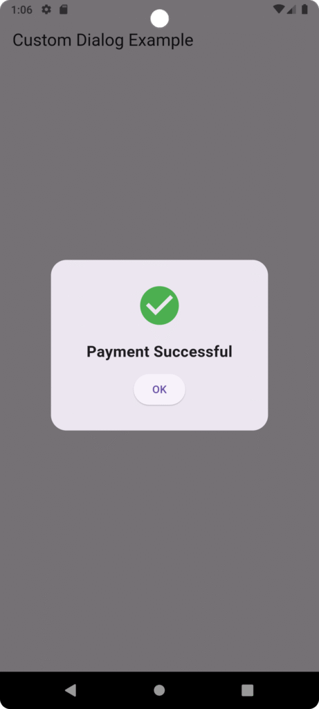
3️⃣ Custom Dialog in Flutter
Sometimes default AlertDialog design is not enough. We can create a fully customized dialog using Dialog widget.
Example: Custom Success Dialog
import 'package:flutter/material.dart';


void main(){
  runApp(MaterialApp(
    home: HomeScreen(),
  ));
}
class HomeScreen extends StatelessWidget {
  const HomeScreen({super.key});

  // Function to show success dialog
  void showSuccessDialog(BuildContext context) {
    showDialog(
      context: context,
      builder: (context) {
        return Dialog(
          shape: RoundedRectangleBorder(
            borderRadius: BorderRadius.circular(20),
          ),
          child: Container(
            padding: const EdgeInsets.all(20),
            height: 220,
            child: Column(
              mainAxisAlignment: MainAxisAlignment.center,
              children: [
                const Icon(
                  Icons.check_circle,
                  color: Colors.green,
                  size: 60,
                ),
                const SizedBox(height: 15),
                const Text(
                  "Payment Successful",
                  style: TextStyle(
                    fontSize: 20,
                    fontWeight: FontWeight.bold,
                  ),
                ),
                const SizedBox(height: 10),
                ElevatedButton(
                  onPressed: () {
                    Navigator.pop(context); // Close dialog
                  },
                  child: const Text("OK"),
                )
              ],
            ),
          ),
        );
      },
    );
  }

  @override
  Widget build(BuildContext context) {
    return Scaffold(
      appBar: AppBar(
        title: const Text("Custom Dialog Example"),
      ),
      body: Center(
        child: ElevatedButton(
          onPressed: () {
            showSuccessDialog(context);
          },
          child: const Text("Pay Now"),
        ),
      ),
    );
  }
}
Why Use Custom Dialog?
-
Better UI control
-
Add animations
-
Add images/icons
-
Fully responsive layout
-
Branded design
4️⃣ SnackBars in Flutter
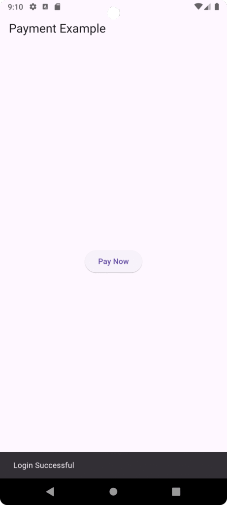
A SnackBar is a lightweight message displayed at the bottom of the screen for a short time.
Used for:
-
Success message
-
Error message
-
Action confirmation
-
Undo option
Basic SnackBar Example
import 'package:flutter/material.dart';

void main() {
  runApp(const MyApp());
}

class MyApp extends StatelessWidget {
  const MyApp({super.key});

  @override
  Widget build(BuildContext context) {
    return const MaterialApp(
      debugShowCheckedModeBanner: false,
      home: PaymentScreen(),
    );
  }
}

class PaymentScreen extends StatelessWidget {
  const PaymentScreen({super.key});

  @override
  Widget build(BuildContext context) {
    return Scaffold(
      appBar: AppBar(
        title: const Text("Payment Example"),
      ),
      body: Center(
        child: ElevatedButton(
          onPressed: () {
            ScaffoldMessenger.of(context).showSnackBar(
              const SnackBar(
                content: Text("Login Successful"),
                duration: Duration(seconds: 2),
              ),
            );
          },
          child: const Text("Pay Now"),
        ),
      ),
    );
  }
}
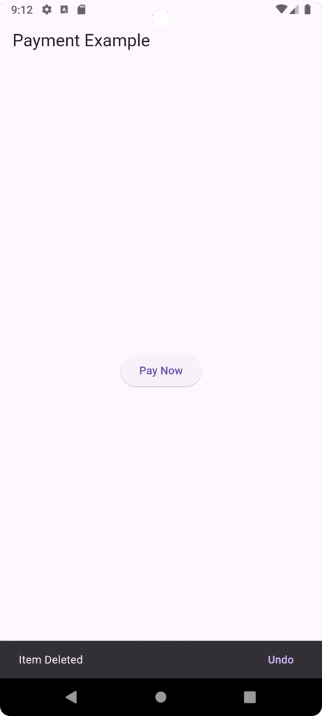
SnackBar with Action Button
import 'package:flutter/material.dart';

void main() {
  runApp(const MyApp());
}

class MyApp extends StatelessWidget {
  const MyApp({super.key});

  @override
  Widget build(BuildContext context) {
    return const MaterialApp(
      debugShowCheckedModeBanner: false,
      home: PaymentScreen(),
    );
  }
}

class PaymentScreen extends StatelessWidget {
  const PaymentScreen({super.key});

  @override
  Widget build(BuildContext context) {
    return Scaffold(
      appBar: AppBar(
        title: const Text("Payment Example"),
      ),
      body: Center(
        child: ElevatedButton(
          onPressed: () {
            ScaffoldMessenger.of(context).showSnackBar(
              SnackBar(
                content: const Text("Item Deleted"),
                action: SnackBarAction(
                  label: "Undo",
                  onPressed: () {
                    print("Undo Clicked");
                  },
                ),
              ),
            );
          },
          child: const Text("Pay Now"),
        ),
      ),
    );
  }
}
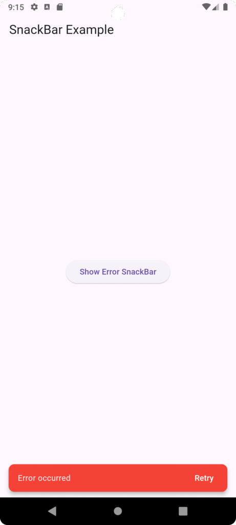
Custom Styled SnackBar
import 'package:flutter/material.dart';

void main() {
  runApp(const MyApp());
}

class MyApp extends StatelessWidget {
  const MyApp({super.key});

  @override
  Widget build(BuildContext context) {
    return const MaterialApp(
      debugShowCheckedModeBanner: false,
      home: SnackBarExample(),
    );
  }
}

class SnackBarExample extends StatelessWidget {
  const SnackBarExample({super.key});

  void showErrorSnackBar(BuildContext context) {
    ScaffoldMessenger.of(context).showSnackBar(
      SnackBar(
        content: const Text("Error occurred"),
        backgroundColor: Colors.red,
        behavior: SnackBarBehavior.floating,
        shape: RoundedRectangleBorder(
          borderRadius: BorderRadius.circular(10),
        ),
        duration: const Duration(seconds: 3),
        action: SnackBarAction(
          label: "Retry",
          textColor: Colors.white,
          onPressed: () {
            print("Retry clicked");
          },
        ),
      ),
    );
  }

  @override
  Widget build(BuildContext context) {
    return Scaffold(
      appBar: AppBar(
        title: const Text("SnackBar Example"),
      ),
      body: Center(
        child: ElevatedButton(
          onPressed: () {
            showErrorSnackBar(context);
          },
          child: const Text("Show Error SnackBar"),
        ),
      ),
    );
  }
}
5️⃣ Toast Messages in Flutter
Flutter does not provide built-in Toast messages like Android. For that, we use a package.
Step 1: Add Dependency in pubspec.yaml
flutter-toast: ^8.2.4
Step 2: Import Package
import 'package:fluttertoast/fluttertoast.dart';
Step 3: Show Toast Message
import 'package:flutter/material.dart';
import 'package:fluttertoast/fluttertoast.dart';

void main() {
  runApp(const MyApp());
}

class MyApp extends StatelessWidget {
  const MyApp({super.key});

  @override
  Widget build(BuildContext context) {
    return const MaterialApp(
      debugShowCheckedModeBanner: false,
      home: ToastExample(),
    );
  }
}

class ToastExample extends StatelessWidget {
  const ToastExample({super.key});

  void showToastMessage() {
    Fluttertoast.showToast(
      msg: "Profile Updated Successfully",
      toastLength: Toast.LENGTH_SHORT,
      gravity: ToastGravity.BOTTOM,
      backgroundColor: Colors.black,
      textColor: Colors.white,
      fontSize: 16.0,
    );
  }

  @override
  Widget build(BuildContext context) {
    return Scaffold(
      appBar: AppBar(
        title: const Text("Flutter Toast Example"),
      ),
      body: Center(
        child: ElevatedButton(
          onPressed: () {
            showToastMessage();
          },
          child: const Text("Update Profile"),
        ),
      ),
    );
  }
}
When to Use Toast vs SnackBar?
| Feature | SnackBar | Toast |
|---|---|---|
| Needs context | Yes | No |
| Customization | High | Limited |
| Action button | Yes | No |
| Material UI | Yes | No |
Real-World Example Scenario
Consider a Food Delivery App:
-
When user deletes item → Show confirmation dialog
-
After deletion → Show SnackBar with Undo
-
On successful payment → Show custom success dialog
-
When profile updated → Show toast
This layered feedback improves UX and professional quality.

")
